BetterDay
Mealtime made easy.
BetterDay came to us with a clear mission: to make healthy eating easier for real people with real lives. No stress. No guilt. No takeout regret. What they needed was a new name and a visual identity that could match the warmth, clarity, and groundedness of their offering, without losing sight of the energy it takes to deliver over half a million meals across the province.
Formerly known as Sprout Meals, we helped them rename to BetterDay—a name that speaks to their bigger mission, their growing audience, and the very real impact of one good meal in the middle of a busy day.
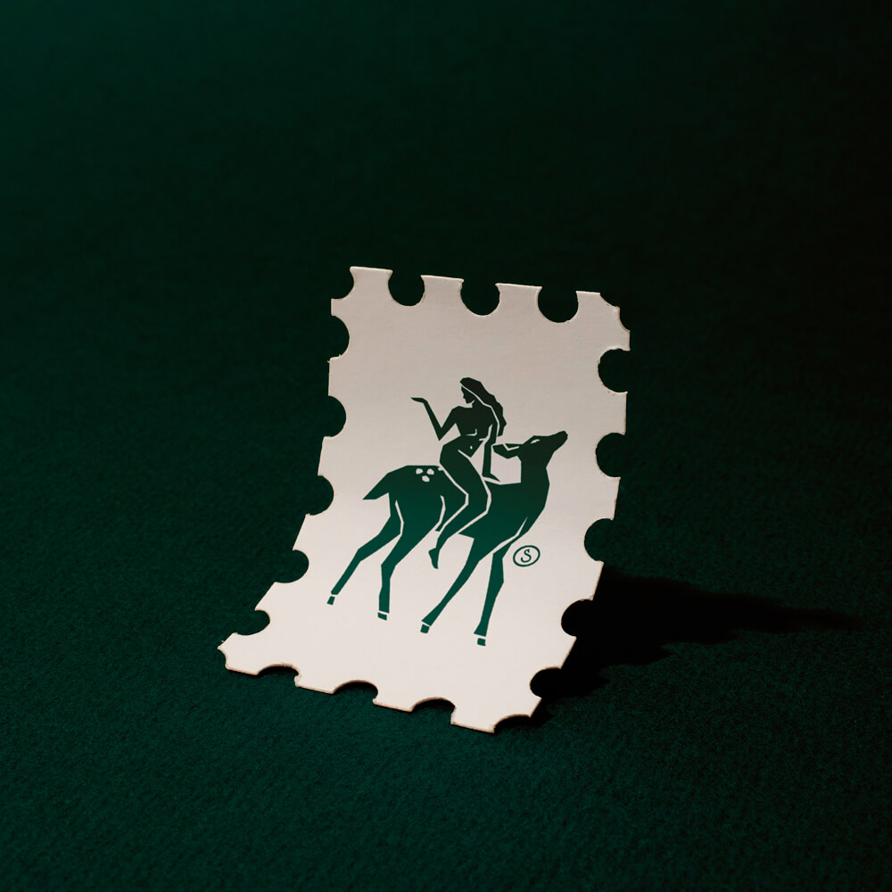
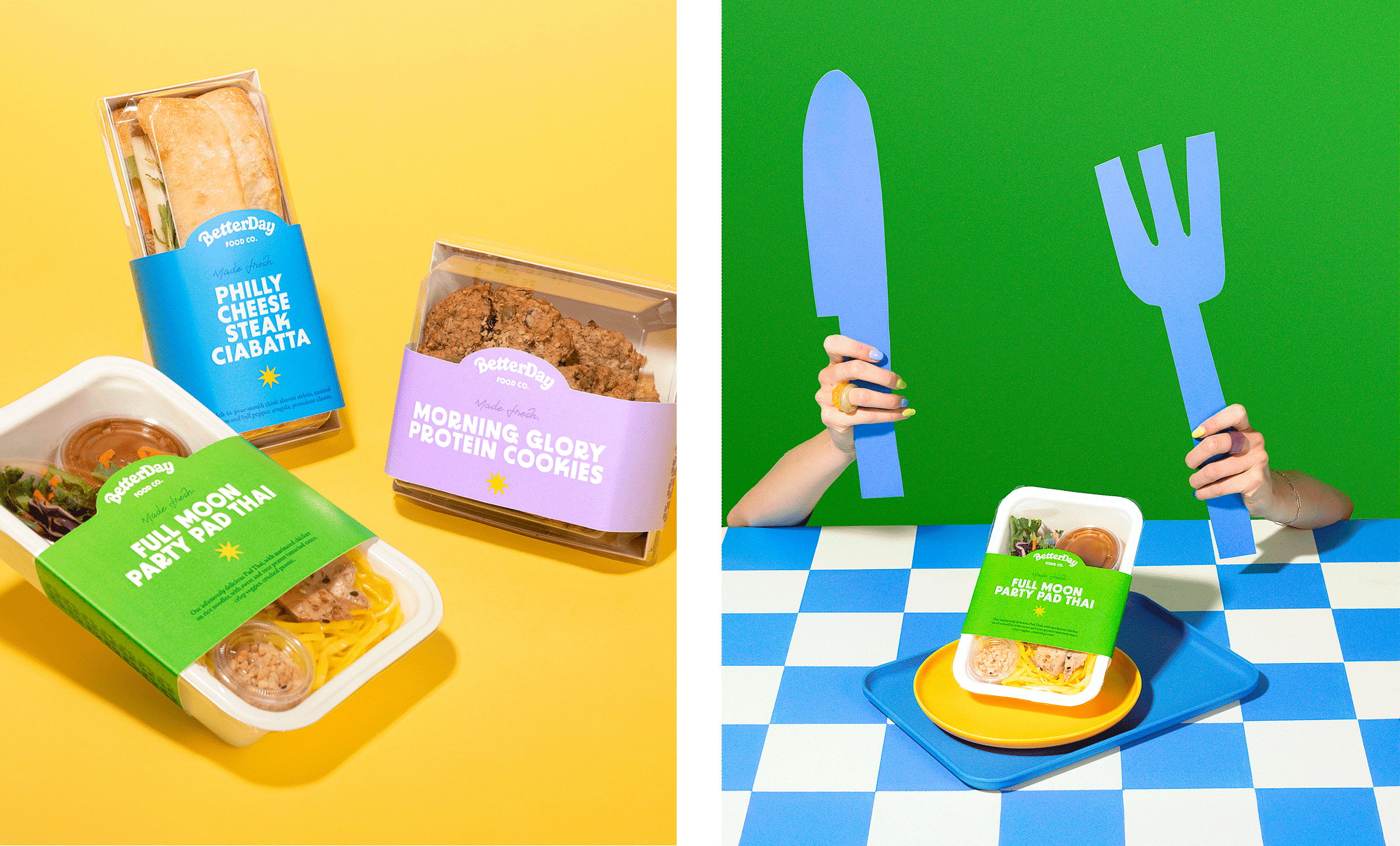
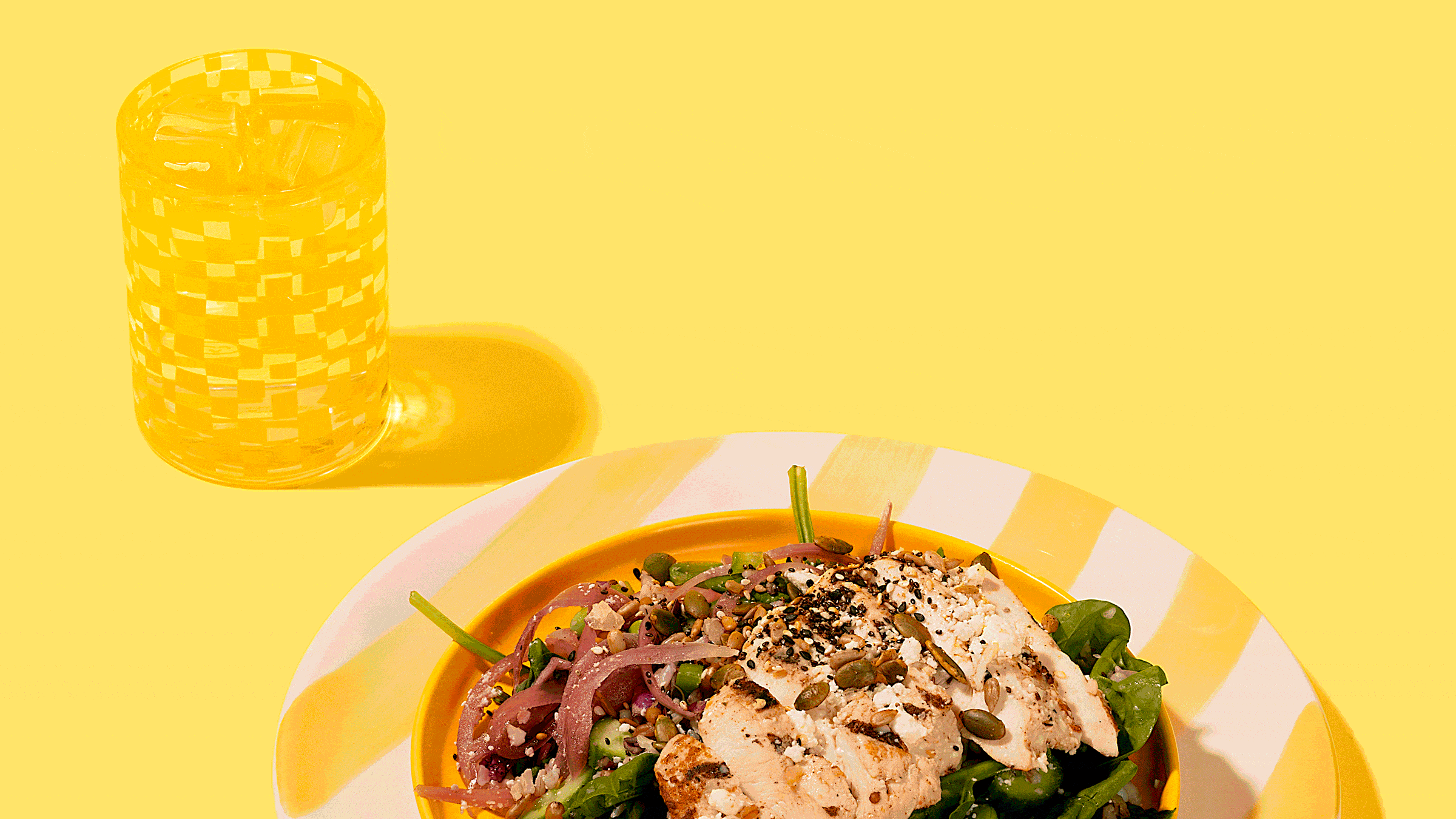
In a 5-Day Brand Sprint, we built out a visual identity that reflects what they’re really about: good food, made simple. The new look is clean but friendly, colourful, and layered with small design moments that remind you this is made by humans.
We delivered a suite of core visual tools to help them roll it out with confidence: wordmark, brandmark, colour palette, type hierarchy, illustration system, and branded graphics, plus usage examples to show how it all comes to life across packaging, digital, and everyday touchpoints.
Because for a brand built on ease and enjoyment, the identity had to follow suit.
Contributions
Naming, Brand Sprint, Photography
Industry
Food & Beverage
Year Completed
2025
BetterDay
Mealtime made easy.

BetterDay came to us with a clear mission: to make healthy eating easier for real people with real lives. No stress. No guilt. No takeout regret. What they needed was a new name and a visual identity that could match the warmth, clarity, and groundedness of their offering, without losing sight of the energy it takes to deliver over half a million meals across the province.
Formerly known as Sprout Meals, we helped them rename to BetterDay—a name that speaks to their bigger mission, their growing audience, and the very real impact of one good meal in the middle of a busy day.
In a 5-Day Brand Sprint, we built out a visual identity that reflects what they’re really about: good food, made simple. The new look is clean but friendly, colourful, and layered with small design moments that remind you this is made by humans.
We delivered a suite of core visual tools to help them roll it out with confidence: wordmark, brandmark, colour palette, type hierarchy, illustration system, and branded graphics, plus usage examples to show how it all comes to life across packaging, digital, and everyday touchpoints.
Because for a brand built on ease and enjoyment, the identity had to follow suit.
Contributions
Naming, Brand Sprint, Photography
Industry
Year Completed


Explore Recent Sprints