The grant bulletin
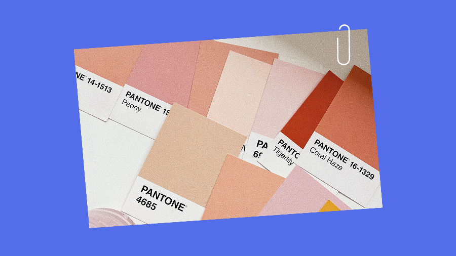
When you’re bored of your brand (and what to do about it)
Restless with your own logo? You’re definitely not alone.
Insights

We're beyond thrilled to share our collaboration with Blume, the beloved brand that’s been making waves in the wellness world for many years now with their Superfood Lattes. Working with a brand we genuinely love was a dream come true and we're so excited to finally be able to shout about it from the rooftops.
Blume is a Canadian, woman-owned company beloved for its superfood lattes that are as equally kind to our tastebuds as they are to our guts — think Salted Caramel Lattes but with maca and dates.
Founded in 2017, Blume was born from co-founder & CEO Karen Danudjaja's drive to create a café option that tasted great and actually did something good for the body. Blume quickly gained popularity in mugs across the continent by doing just that — their delicious, good-for-you blends offered a wonderful alternative to coffee culture's status-quo of highly-caffeinated espresso, sugary syrups, and other non-gut-friendly additives that negatively affect digestion, sleep, and hormone balance.
After successfully pitching their Superfood Lattes on Dragon's Den, Blume's popularity continued to soar and their oh-so-aesthetically pleasing packages became regulars on shelves in cafés, independent retailers, and supermarkets across North America. At the same time, their 2DC channel and online marketing efforts thrived.
They came to us with a solid following, excellent brand recognition in the health foods space, and a (very) loyal community. Innovating within the health and wellness sphere isn't easy, but Blume took Superfoods to a new level that felt refreshingly free from macro-counting.
When Blume approached us to work together, the brand had already achieved strong reach, recognition, and notoriety. As with any update to well-established brands, a huge challenge lies in the balance of knowing what core brand elements to preserve and where changes are necessary for growth.
The challenge was multi-faceted, involving:
Blume's original Superfood Latte packaging served them well. It's minimal and elevated design made it an aesthetic addition to kitchen shelves, and the range of pretty pastels in its colour palette made it instantly recognizable in stores. Where health-food packaging often 'feature-dumps' (resulting in an overwhelming amount of squished-in text, callouts, and images), Blume committed to the opposite end of the spectrum. By prioritizing white-space and clean design, their packaging successfully represented what drinking their products feels like: a breath of fresh air.
However, as Blume expanded into new markets and larger chain retailers where brand recognition was lower, their research showed that customers were having trouble quickly understanding the totality of Blume's benefits and differentiators. When faced with a decision between Blume and a similar product, consumers would often go for the product with more information on their packaging and therefore provided a better understanding of the product itself.
The challenge in this packaging update was to make their staple product line, their Superfood Lattes, more informative for quick grocery-aisle decisions without losing their very well established minimal and elevated aesthetic that they had become known for.
Ready to expand their current product offering, Blume came to us to help launch an entirely new line of products — gut-building water elixirs, offered in powder-form and packaged in ready-to-mix packets. With probiotics, prebiotics, AND superfood ingredients, this new product (eventually named SuperBelly) was inspired by Superfood Latte's disruptiveness, and similarly would offer an alternative to the status-quo of available 'health drinks' (often filled with sugars, fillers, and artificial ingredients). We needed something bold that would stand out on the shelves in a brand new space, still feel like Blume, but be enough of a visual departure that it was successful amongst a whole new set of competitors.
Arguably, the trickiest part of our work together was expanding their current brand and assets. Karen knew that there was a deeper layer to the brand that wasn't fully represented in its visual identity. After digging deeper, it became clear what was missing — kindness and fun were deeply ingrained in their culture but underrepresented in how the brand expressed itself visually. Our challenge was to figure out how to both refine and expand their existing brand identity to better represent their grounded, approachable, and fun side — all while still having it feel very 'Blume'.

We imagined what it would look like to maintain Blume’s logo but do a relatively large overhaul on the general feel of the packaging, then went through a few stages of ideation. Would the audience still recognize them? Would it solve our problem of making their product more apparent to new customers?
Take a look at some of our preliminary ideas:

We found that after this phase, it was going to be important to remain quite true to the brand in order to maintain their goodwill – by going through this ideation, we were able to test what worked, but more importantly, what didn't.
In the end, these were too far of a departure for the brand, and the general consensus was that it shouldn't stray too far from the existing look.
With these ideas incorporated, we could stay true to the brand while still getting the message across.In the end, we were able to elevate the original packaging by updating the layout, adding noticeable callouts, product imagery, and a new type hierarchy. Here are the results!

With this brand-new product, we had to start with the ideation of the name. Here are some of our favourite tossed ideas:
The Blume team loved SuperBelly, so we put our heads down and got to work on the design. We worked on maintaining the simplicity of the brand but wanted to add a unique element that would set it apart on the shelves.
Blume's hands-on approach meant we often had 'design on the spot' sessions, allowing for immediate feedback and quick adjustments as we got closer and closer to the final product. These sessions were a great way to flex our quick-thinking skills and adapt to their passionate and involved style.

During the packaging redesign, we took the opportunity to expand Blume’s brand significantly. This included introducing a new brandmark, custom illustrations, additional brand colours, and a completely revamped typography hierarchy. Our aim was to rejuvenate Blume's brand image while maintaining consistency with their established identity.

The launch of SuperBelly exceeded expectations. The product sold out within two weeks and achieved $2 million in sales within months. Blume's community embraced the new branding and packaging enthusiastically.
While the new superfood latte packaging has yet to launch, anticipation is running high. Initial feedback has been extremely positive.
Blume has seamlessly integrated the new brand elements into their website and social media platforms. The response from their community has been overwhelmingly positive.
Quick timeline needs meant we had to order this process a little differently than we usually would have. We finished the Brand Strategy at the end of our work together, but this work would always come first in an ideal world!
Larger brands with big followings are (understandably) going to be protective of directions that feel "too different." Finding the right level of push (when to pitch new ideas) and pull (when to extract what's worked for them in the past) is key with multinational brands.
We really, really like Blume's products. They are now a staple in our office and daily happenings.
Working with Blume was an incredibly rewarding experience. We were able to help them successfully launch a new product and strengthen their brand identity in an impactful way. It’s always such a dream to work for companies we admire, and Blume was on our bucket list from the moment we encountered their brand many years ago.
Restless with your own logo? You’re definitely not alone.
Rebrands can be a pricey way to say “we’re bored.” What does your brand need?

Think logo animations, slick explainer videos, and animated social content.

Motion sounds fancy. Maybe even expensive. But it doesn't have to be!


